Kennisbank
Leesbaarheid op afstand: hoe groot moet tekst op je sticker zijn?
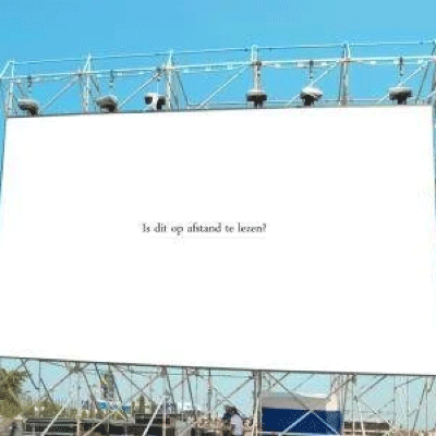
Een sticker, reclamebord of raamuiting kan er van dichtbij perfect uitzien, maar op afstand toch slecht leesbaar zijn. Vooral bij sportvelden, gevelreclame, voertuigen, vloerstickers en etalages is lettergrootte belangrijker dan veel ontwerpen laten zien.
 Ontwerp tekst altijd voor de afstand waarop je klant de sticker echt ziet.
Kort antwoord
Voor tekst op stickers en reclame-uitingen kun je als snelle vuistregel gebruiken: deel de kijkafstand in meters door 3. De uitkomst is de minimale letterhoogte in centimeters. Een tekst die vanaf 60 meter leesbaar moet zijn, vraagt dus om letters van ongeveer 20 cm hoog. Bij snelheid, slecht contrast, drukke achtergronden of veel tekst moet je groter ontwerpen.
Afstand
Letterhoogte bepaalt herkenning
Hoe verder iemand van de uiting af staat, hoe groter de letters moeten zijn. Dat geldt ook voor logo’s en QR-codes.
Snelheid
Lezen vanuit beweging vraagt meer
Een voetganger heeft meer tijd dan een automobilist. Bij verkeer of sportvelden moet de boodschap extra kort en groot zijn.
Contrast
Kleur maakt of breekt je ontwerp
Tekst valt weg wanneer kleur en ondergrond te dicht bij elkaar liggen. Hoog contrast is vaak belangrijker dan veel details.
Vuistregel
Formule voor lettergrootte op afstand
Voor een snelle inschatting kun je deze eenvoudige formule gebruiken. Het is geen harde technische norm, maar wel een praktische manier om te voorkomen dat tekst te klein wordt ontworpen.
Kijkafstand in meters / 3 = minimale letterhoogte in centimeters
Voorbeeld: wil je dat een tekst vanaf 100 meter leesbaar is? Dan deel je 100 door 3. Je komt uit op ongeveer 33 cm. Dat betekent dat de hoofdtekst minimaal rond de 33 cm hoog moet zijn. Voor kleinere subteksten, drukke achtergronden of hoge snelheid is groter vaak beter.
Afstandstabel
Richtlijn voor tekstgrootte
| Kijkafstand |
Minimale letterhoogte |
Voorbeelden |
| 30 tot 100 cm |
2 tot 4 mm of groter |
Productlabels, etiketten, verpakkingsstickers en kleine waarschuwingslabels die van dichtbij worden gelezen. Technisch minimum: lijndikte 1 pt en fontgrootte 4 pt, maar voor goede leesbaarheid adviseren we waar mogelijk groter. |
| 3 meter |
1 cm |
Balie-informatie, deurstickers, kleine raamstickers en korte teksten die nog steeds van relatief dichtbij worden bekeken. |
| 10 meter |
3 tot 4 cm |
Etalages, deuren, korte routing, kantoorstickers. |
| 30 meter |
10 cm |
Gevelstickers, sportveldreclame, banners, voertuigen op lage snelheid. |
| 60 meter |
20 cm |
Reclameborden, grote raamuitingen, evenementensigning. |
| 100 meter |
33 cm of groter |
Sportvelden, bedrijfshallen, buitenreclame en toepassingen met veel kijkafstand. |
Gebruik deze tabel als startpunt. Bij kijkers in beweging, mat contrast of een drukke achtergrond adviseren we om groter en eenvoudiger te ontwerpen.
Ontwerpkeuzes
Wat maakt een sticker goed leesbaar?
Leesbaarheid draait niet alleen om lettergrootte. Een te dun lettertype, weinig contrast, te veel informatie of een drukke achtergrond kan een grote sticker alsnog onduidelijk maken.
- Gebruik korte woorden en beperk de boodschap tot de kern.
- Kies een goed leesbaar lettertype met voldoende dikte.
- Vergroot de letterafstand bij grote teksten en lange kijkafstand.
- Zorg voor duidelijk contrast tussen tekst en ondergrond.
- Test het ontwerp op het echte formaat, niet alleen op je beeldscherm.
Ontwerpservice
Twijfel over formaat of leesbaarheid?
Onze studio kan meekijken naar lettergrootte, contrast, snijlijnen, witruimte, materiaalkeuze en technische aanlevering. Handig bij gevelreclame, raamstickers, vloerstickers en grotere stickers op afstand.
Toepassingen
Waar is leesbaarheid extra belangrijk?
Ramen en gevels
Raamstickers en buitenreclame
Zorg dat tekst niet wegvalt tegen reflectie, baksteen, lucht of een donkere winkelinrichting.
Bekijk raamstickers
Routing
Vloerstickers en bewegwijzering
Bij vloerstickers moet de boodschap snel te begrijpen zijn, vaak terwijl iemand loopt.
Bekijk vloerstickers
Voertuigen
Voertuigstickers en autoreclame
Een rijdend voertuig vraagt om grote tekst, weinig woorden en een duidelijke call-to-action.
Bekijk voertuigstickers
Aanlevering
Controleer ook je bestand
Een goed leesbaar ontwerp moet technisch ook goed worden aangeleverd. Denk aan voldoende resolutie, vectorbestanden voor tekst en logo’s, juiste snijlijnen en afloop. Zeker bij grote stickers is het belangrijk dat de schaal klopt.
- Lever tekst en logo’s bij voorkeur vectorieel aan.
- Houd bij productlabels en etiketten minimaal 1 pt lijndikte en 4 pt fontgrootte aan.
- Gebruik voldoende resolutie bij foto’s of pixelbeelden.
- Controleer snijlijnen, afloop en veilige marges.
- Gebruik de aanleverspecificaties voordat je definitief bestelt.
Veelgestelde vragen
FAQ over leesbaarheid op afstand
Hoe groot moet tekst zijn om op afstand leesbaar te zijn?
Als vuistregel deel je de kijkafstand in meters door 3. De uitkomst is de minimale letterhoogte in centimeters.
Welke lettergrootte heb ik nodig op 60 meter?
Voor 60 meter kom je uit op ongeveer 20 cm letterhoogte. Bij snelheid of slecht contrast is groter verstandiger.
Welke kleuren zijn goed leesbaar?
Kies kleuren met hoog contrast. Wit op donker, zwart op licht of rood/wit kan goed werken, afhankelijk van ondergrond en omgeving.
Waarom is mijn sticker van dichtbij goed, maar op afstand niet?
Vaak komt dat door te kleine tekst, te weinig contrast, een te druk ontwerp of een achtergrond die de tekst laat wegvallen.
Kan Dr.Sticker mijn ontwerp controleren?
Ja. Via de ontwerpservice kun je je ontwerp laten controleren, aanpassen of druk-klaar laten maken.
Waar vind ik de aanleverspecificaties?
De aanleverspecificaties staan online als PDF. Daarin vind je richtlijnen voor bestanden, snijlijnen, afloop en resolutie.
Interne links
Handige vervolgstappen
Wil je zeker weten dat je sticker leesbaar is?
Bestel direct wanneer je ontwerp klaar is, of laat onze studio meekijken naar formaat, contrast, bestand en materiaalkeuze.